Written by Austin Berry, President
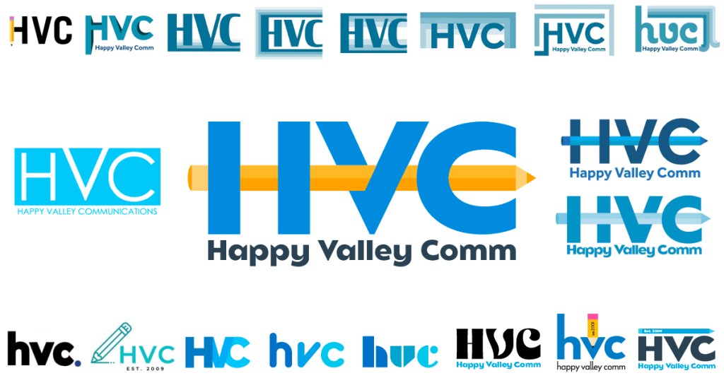
First off, I want to thank all the board members for working with me over the summer in order to make this rebrand become a reality. The patience and cooperation shown during their break from classes and extracurricular activities did not go unnoticed. Additionally, I want to give credit where credit is due and shoutout Avery Shandelman who is HVC’s first Director of Design. He was critical through this entire process and created the concept for this logo shown on the middle right of the image above. Without his commitment and that of the other board members, this would truly not have been possible.
Now then, why spend all this time in the summer on a new logo and brand for our student organization? Let me stop right there and call HVC more than just a student org as it has been a springboard for countless Penn State students. HVC is a student run agency that allows students, regardless of college, major, or career interests, the essential real-world working experiences they so desperately need. Especially in a time like this when internships are uncertain, HVC’s role in preparing students for their work life after college becomes even more essential for their future success.
For HVC to grow in the coming semesters and years, I believe it was key for the organization to take on an updated look and further strengthen our brand identity among both students and the community. However, we did not want to jeopardize our current identity or relationships, so we were sure to be inspired by the past through continuing to incorporate our light blue and only add to it through our rebranding which now features orange and slate as well.
Our updated blue represents HVC’s past and the sacred value of tradition which Penn State holds so dear. Our new orange mimics that of a pencil in order to represent our commitment to students. Last but certainly not least our slate color evokes the mountains of the area and represents the bedrock of importance which the Happy Valley community holds with us. Another key component of the rebrand was our new tagline, “Student Run. Community Focused.” Which further emphasizes our role in not only the local community, but the Penn State family of students as well.
The most important thing for us now is to welcome Account Associates, both new and old! This fall is going to be a very exciting time for our student members as we potentially have our best lineup of clients to date and cannot wait to begin working with them in the coming weeks. Looking forward to seeing you all very soon and to a great semester to come. Stay tuned this fall to see more of our branding!
